How To Optimise Your Website For Mobile SEO in 2020 & Beyond
11 August 2020
11 August 2020
For a while now, mobile searches have surpassed those on desktops. When you don’t have a mobile SEO strategy in place, you are likely ignoring the needs of your consumer base!
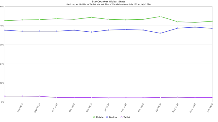
Source: StatCounter Global Stats - Platform Comparison Market Share
If you are reading this article, you are probably aware that SEO stands for “Search Engine Optimisation”. It refers to the practice of achieving increased visibility for your website on the organic search engine results page. If you need a bit more of an explanation, you may want to check out our beginners guide to SEO.
When you refer to “Mobile SEO”, it means that you are specifically targeting ways in which to improve the ranking factors of a website on mobile devices.
Simply having a responsive website in 2020 does not necessarily mean that your website is “mobile-first”. Don’t get me wrong; it’s very important, but you will need to implement a range of advanced mobile SEO techniques to ensure your website visitors have the best experience possible.
The gap between mobile & desktop users is only increasing & unless you start taking this into account moving forward into the second half of 2020 & beyond, you may begin to see a fall in your Search Engine Results Page (SERP) rankings as well as lower conversion rates to boot. Experts feel that by 2025, nearly 75% of people will only be using smartphones to access the internet, so it is vital that you get ahead of the curve.
Google announced in March 2020 that all sites will be crawled and indexed by them, using mobile-first indexing by September 2020 (Has since been moved to March 2021) & it is worth noting that 70% of sites shown in search have already been switched over. When Google tells you something in relation to mobile SEO, you listen! This is because they own nearly 95% of the mobile search market.
The SEO team here at Loud Mouth Media, are always striving to stay on top of all the latest ranking factors & algorithms, that have an effect on your websites SEO. In this article, we will look at some of the top ways to help optimise for mobile SEO in 2020.
With a mobile-first strategy, the mobile version of your website is seen as the first port of call when it comes to Google Indexing your website. Therefore, a lack of solid user experience on mobile devices could have a detrimental effect on your website's SERP rankings. On the other side of the coin, if you are offering users a great mobile experience, you may notice that you will begin to climb the Search Engine Rankings, even on desktop!
Now more than ever, it is important to give the mobile version of your website a thorough once over. Does your content load quickly? Is the design & user interface clean enough? Is the text easy to read? Are the buttons large & easy to click? If you are offering users the best experience on their mobile device, you may soon find yourself reaping the rewards.
With responsive design, the contents & layout of a page responds uniquely to each individual user & their device. Unlike having a mobile version of your site & dynamic serving, responsive design is able to do this from a single URL (saving you a lot of SEO heartache along the way!).
To ensure that your site is Mobile SEO ready, a responsive website is a must. No matter what device your visitor is using, you need to ensure they have a fantastic experience.
If you are running your website on WordPress, you will have a plethora of themes & plugins to choose from, that help cater your website on multiple devices. However, if you aren’t operating off WordPress, you will more than likely have to enlist the help of a developer to create a responsive website for you.
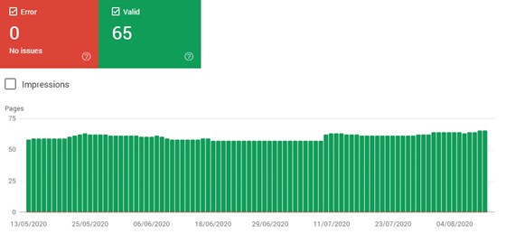
If you feel you already have a website that is mobile-ready, check out the Mobile usability testing tool found in your Google Search Console (GSC). All you need to do is, open your GSC account & click on “Mobile Usability” under the “Enhancements” tab. From here, Google will flag up any potential issues that you may have. Common problems include flash content, small font sizes & clickable elements that are too close together. It’s important to manually review all of these issues, to ensure that your user's experience on your site is in no way hindered.
Not only is it important how Google is viewing your website, but what are your visitors actually seeing? A testing tool that I like to use is found at https://ready.mobi/. It’s a great way to see how your website looks on multiple devices, & it makes it so simple to find any niggly UX issues that might appear on your site.
The days where you stuff a page full of keywords have long since past.
Not only should you be looking to please Search Engines, but by providing users with an easy to use website, you encourage them to return. Having a website that is optimised for mobile devices makes your business look like a more professional outfit, which in turn will increase users trust in you & your brand.
Your main aim is to encourage people to stay on your website for as long as possible, also known as “dwell time”. This, in turn, will lower bounce rates & increase the chances that a user will complete the desired action on your website. Whether that be to, download a PDF, subscribe to a newsletter, or ultimately make a purchase.
Opinions differ as to how much of a direct impact dwell time has as one of Google's major ranking factors, but nobody argues that increasing it will only help your websites SERP rankings. Use some of our tips below to help keep people on your site.
Studies have shown that over half of your potential customers will bounce off your site if it takes more than 3 seconds to load. Google themselves ideally want a site to load in under 1 second! However, if you are keeping your load speeds to under 3 seconds, you are not going too far wrong.
Thankfully there are tools you need to keep on top of these issues. The Page Speed Insight tool from Google helps gives you an idea of how long your website takes to load on both desktop & mobile, as well as some handy recommendations that you can use to help speed things up.
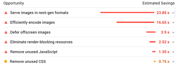
Even if you are not the most technically savvy person in the world, there are some common issues with your websites speed that can be rectified quite simply. The above example was taken from a website, where the image sizes had not been reduced to cater to the web.
Ensuring that you keep your images sizes low whilst maintaining their quality, is the number 1 aim when optimising images for a website. The team at foreground.com have put together a piece with some of the best practices in regards to this.
For the more technical elements that affect your website's speed, you might want to touch base with your web developer, as it will require some work with the website's code & styling sheets. There are a number of useful WordPress plugins but if you have no knowledge of web development, it would be best to consult someone who has more expertise in this area.
If you want really in-depth statistics for speed, WebPageTest.org & GTMetrix.com are also two great resources, that help pinpoint the main areas where you can trim them loading times.
You can no longer expect users to pinch & rotate their screens to decipher the content on your website. Users will leave faster than they arrived if this is the case.
Even with responsive websites, people have a tendency to clutter the page with as much information as possible, leaving the text & images incredibly difficult to read.
Instead, you want your images big & clear as well as text that is easily legible. Much like in the example below:

Some general guidelines that we tend to abide by include:
I’m personally not a fan of the hamburger menu on desktop versions of the site, as it often delays users navigating their way through a website. However, it is hard to argue the benefits of it on mobile versions of websites.
Mobile devices don’t have the screen space to be displaying multiple drop-down menus, all of which may have several subcategories.
Obviously, these menus do tend to take up the majority of the screen once they have been opened. However, it is hard to argue that this doesn’t cater itself to improving the user experience & helping users navigate the site as simple as possible.
Many of you reading may be surprised that I am even addressing this issue, but you would be amazed at the number of websites that I review, which still has content coded in Flash. Google will likely penalise sites that use software not common with mobile phones i.e. Flash, so ensure to remove any remanence of it on your site, when you are focusing on your website’s mobile SEO.
Nobody is asking for any webmasters to remove popups entirely. For many websites, they are a crucial cog in their lead generation efforts. The problem arises when these popups result in negative user experience. All of us have an example of visiting a site where something has unexpectedly appeared on the screen. Having pop-ups that have not been optimised for mobile devices only lends itself to a massively increased bounce rate & lower SERP rankings.
Therefore, it is crucial for you to include Screen Friendly popups on your websites.
Not to sing our praises too much here at Loud Mouth Media, but we think we do the job rather well.

Rather than bothering the user by taking up the whole screen, with our chatbot asking to help them, we instead feel it’s much more beneficial to include a non-intrusive message at the bottom of the page that is always just a click away from the user, yet still offering them a complete few of the entire page & easy navigation across the site. These style of popups are much less likely to hurt the user's experience & mobile SEO.
We couldn’t talk about SEO in 2020 & not make some comment on Voice Search. Year on year we are continuing to see a rise, particularly amongst the younger generation on their mobile devices. Voice search is now becoming the social norm rather than the exception. It’s not something for the future, the statistics continue to show that it is becoming part of everyday life.
The strategy involved with voice search will have to be tweaked from traditional SEO methods. However, it is already clear that early adopters who are in the process of optimising for voice search will be those that will benefit the most.
Voice search differs from a traditional query that you would type out, through the fact that it adopts much more of a natural tone. Almost as if you were having a conversation with someone. The aim is to provide the user with answers that can be covered as accurately & succinctly as possible, with less of an emphasis on stuffing a bunch of keywords into your answer.
Backlinko highlighted that on average, 29-word answers worked best with voice search queries. Bear this in mind, whilst also paying consideration to user intent & contextual answers.
Some of the websites that we have worked on in the past have blocked crawlers from viewing images, JavaScript & CSS files.
When Google can’t crawl these elements, it makes it impossible for them to know if your website is mobile-friendly. If this is the case, how can you expect to rank highly in a mobile-first index?
To unblock a resource, simply update your robots.txt file. You can find your robots.txt file at “(your site)/robots.txt”. You can also view what resources you are blocking from within your GSC. So just make sure you aren’t blocking anything that will affect how Google views your site.

If you are receiving the vast majority of your Organic Traffic through Mobile, it may be worth optimising your Title tags to cater for Mobile Search Results.
It will probably come as a surprise to you that Google displays more Meta Title characters on mobile than you would see on a desktop.
The recommended limit for Title tags on a desktop is 70 whereas, with mobile 78 is seen to be the maximum.
So if there is an instance where you feel an additional two or three keywords, will really help improve your rankings & bump up your click-through rate (CTR), it may be worth accepting a truncated Title tag on desktop, especially if it only accounts for a small amount of your traffic & if you begin to see a noticeable increase in the CTR on mobile.
Although, like with any changes you make to your website, ensure to monitor the results carefully & revert to the previous state, should you continue to see negative results.
So, there you have it, these are some of our top tips & areas that you should focus on when optimising your content for mobile. Hopefully, it is a bit clearer that just because your website looks ok on a mobile device, doesn’t mean that it is optimised for mobile SEO. With 100% of websites soon to be ranked using “mobile-first indexing”, mobile searches should be a core element within any SEO strategies you have throughout the rest of 2020 & beyond.
Our SEO team would be delighted to help you with any queries that you may have. Whether that be in relation to Mobile SEO or something entirely different. Get in contact with Loud Mouth Media today!